Sunday, September 30, 2012

Philosoraptor Pro

Philosoraptor Pro App for iPhone
     Yet another app about animal memes.  This time it's that philosophical dinosaur, the Philosoraptor.  Browse through his queries and seek a deeper meaning into life, the universe and everything...
     This is a nice collection of different Philosoraptor sayings.  Some are more funny than others.  Sometimes they are a bit repetitive   However, I think Philosoraptor is my favourite animal meme.
     Unlike the other meme apps I have reviewed (Anti-Joke Chicken & Successful Cat) this one has a much better interface.  The images are larger and the words are above and below the character.
     To browse through the phrases, simply swipe across the screen.  You can click the button on the top right to share, save the image, gift the app, tell a friend about the app or view more of the applications created by ActiveGuru Ltd.
     Below are some sample screens from the application.  You can click on the images to view the larger versions for easier reading.

     I enjoyed the application.  It's simple, to the point.  It produces a variety of entertaining phrases.  It's attractive and not bogged down with extra features.  It ran smoothly for me, with no lagging or crashing.  A fair warning that a few of the statements made by Philospraptor have cursing, sexual situations, religion and other statements that some people may not be comfortable with.  Keep in mind that this application is for entertainment purposes.
Rating: 5/5
  • Free
  • Category: Entertainment
  • Updated: Apr 18, 2012
  • Version: 1.4.0
  • Size: 2.9 MB
  • Language: English
  • Seller: ActiveGuru Ltd.
Rated 12+ for the following:
  • Infrequent/Mild Mature/Suggestive Themes
  • Infrequent/Mild Profanity or Crude Humor
  • Infrequent/Mild Alcohol, Tobacco, or Drug Use or References

Saturday, September 29, 2012

Zombie Panic in Wonderland Plus

Zombie Panic in Wonderland Plus App for iPhone
     What if one day you went to the market to pick up some goods and the town seemed eerily quiet?  The shop keeper was not at his station... No people scurrying about... Then suddenly... Zombies.  Could you fend them off? Can you save yourself?  How long can you survive?
     The graphics and story panels in this game are great.  I love the characters and the game play is quick easy to learn.
     Though the basic free game only has the first chapter in the story (And arcade mode), along with only the one main character, you can still enjoy it.  And when you get tired of playing that, you can always pay for the extra characters or the full story mode.
     The characters can be purchased one at a time or as a bundle.  The bundle is cheaper, but if you just want one or two, you'd be better off buying those separately.  The 'All in one pack" is 12.99 and gives you the story and characters.  It's the best deal but only if you plan to really dedicate yourself to beating the game and using the characters.
     I really enjoyed the story panels and dialog.  I thought they were fun and really well drawn.  You can see a sample to the left.
     During game play mode you can do two things.  Kill zombies and destroy... well... everything.  Walls, buildings, boxes, you name it.  Why not see just how much destruction you can cause before the level ends?
     The zombie apocalypse takes place in a fairy tale land.  This is why so many of the characters are from fairy tales.  They have even recently added a new Alice in Wonderland stage.
     I enjoyed this game so much that I am considering buying an extra character or the full story.  And I'm not even a fan of zombies...  The one thing that's so far kept me from doing so is the price.  now I will grant you that for the quality of this game, it certainly is worth the asking price for the full game (3.99).  The extra characters range from 0.99 to 1.99 each...  All the characters are 5.99 for the set.  But I just don't know if I'm willing to commit to those prices.  I'm more for cheap apps unless it's something I plan to play a lot of.  And though I really enjoyed this and would love to add more detail in the review for the paid features... I'm just not sure I can afford to right now.
     I really love fairy tales, which is what drew me to this application to begin with.  In case you have a similar interest, here is a list of all of the currently available characters. Momotaro (Main character in story mode), Dorothy (Wizard of Oz), Snow White (Snow White & The Seven Dwarfs), Momotaro (Different design), Alice (Alice in Wonderland), Bunny (Assuming also from Alice in Wonderland) and Little Red Riding Hood (Little Red Riding Hood).
     I enjoyed this app and I think you will too.  Especially if you like shooters, zombie games or fairy tale characters.  it's free to try so why not give it a go?  If you like it, feel free to make some in game purchases.  Let me know how the rest of the story plays out!
Rating: 4.5/5
  • Free
  • Category: Games
  • Updated: Sep 20, 2012
  • Version: 2.0
  • Size: 83.0 MB
  • Languages: English, French, German, Italian, Japanese, Spanish
  • Seller: Akaoni Studio SL
Rated 9+ for the following:
  • Infrequent/Mild Mature/Suggestive Themes
  • Infrequent/Mild Horror/Fear Themes
  • Frequent/Intense Cartoon or Fantasy Violence

Tuesday, September 25, 2012

Futurama Head-In-A-Jar Creator

Futurama Head-in-a-Jar Creator App for iPhone
     For those of you who enjoy the popular cartoon series Futurama, you might want to give this free application a try.  It gives you the chance to create your own Futurama head in a jar, based on yourself, your friends, fictional characters or your own unique idea.
     There are 4 parts of this application (You will see this on the main boot screen).  You can watch fun Futurama videos, Visit the "Head Museum" or click "More" to visit the Facebook for this application, rate the application, view more apps from the creator and so no.  the naturally there is the "Get Started" button which will launch the head creator.
     Let's start by covering head creation, as that is the primary function for this application.
     First you choose your "Species".  Available are male, Female (Apparently these are two different species), robot (Why a robot head needs to be in a jar is beyond me) and Alien (Kif's head).
     Once you have your head you can choose from many different options for head shape, eyes, nose, hair, "extras", and a scene.  you also get to name your character.  Depending on what species you choose, and the head shape... You may not have all of the options available to you.  Also, different species have different bits to choose.  You can scroll through the options by swiping across the screen.
     When you are finished creating your character, click the "Done" button.  Your jar will fill with water and you will then be able to share it, send it to your photos, add to a contact (You will see that image when they call you), add to an exhibit (This is essentially creating a group/category for this creator.  Family, Friends, Official Characters" whatever you like), you can edit it or go to your museum (Where you can browse all of the heads you have made).
     About the head museum...  This is where you can either view all of the heads you've made by clicking the "My Heads" option, or view them by category assigned by clicking "My Exhibits".
  The "My Heads button will show a shelf (Or series of shelves) that will have all of the jars set upon it.  You can click the shelf of jars to view the larger version (As they are shown very small here).From the larger version of the shelf (Swipe to view the different jars) you can click any individual jar to share, add to contact, edit, etc.
     The exhibit allows you to view a list of all of your head categories.  Click the category you want to view and you will see any jars you have added to that exhibit.  It will display as it would in the "My Heads" section.  The difference is that you can view only the heads for that category.  Separate your friends from your family.  Separate official heads from original character heads.  This is especially useful if you find yourself making a lot of heads.
     I think this is a really fun application.  The graphics are really great, the app runs smoothly.  There are really fun sound effects through out the app and the fact that they have a videos section is a nice add on.  I really enjoyed playing with this.  I believe it's well worth the download.  And hey, it's free.  So what do you have to lose?  It's especially fun for Futurama fans, clearly.  But I think even people who've never seen the show might enjoy it.
Rating: 5/5
  • Free
  • Category: Entertainment
  • Updated: Jul 10, 2012
  • Version: 2.0
  • Size: 19.0 MB
  • Language: English
  • Seller: MTV Networks

Cute Photo Sticker Free -- Perfect Frames For Your Photos

Cute Photo Sticker Free App for iPhone
     This application has recently been removed from the app store, along with it's paid version counterpart.  I am not 100% sure as to why... However, in case you are able to download it elsewhere, I'll let you know a bit about the application, from my experience.
     This is one of the worst applications for photo editing I've used... Alright, I said it... Let me fill you in on 'why'...
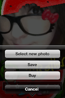
     Most importantly (To me) it does not properly use your photo.  When you use a photo from your album, it will either show the photo sideways (Whether it's landscape or portrait, doesn't seem to matter), or it zooms way in (As you can see on the photo to the right), and does not allow you to resize or zoom out.  This makes editing your photos a bit of a chore.  Taking a new photo usually displays properly, however.
     This is the free version.  the paid version is 99 cents.  The paid version has more frames and stickers, as well as allowing you to choose a frame while taking the photo, rather than afterward.
     Back to the free version...
     There are 20 frames.  many of these same frames are available on the free website Puricute.com.  I am not entirely sure the app creators had permission to take these frames, as they do not give credit to the source at all.
     There are also 25 stickers, 4 pen sizes and some colour filters (IE making your photo look green or blue, etc).
     When you are finished you can click the wrench icon to either choose a different photo, save your photo to your device or purchase the paid version of the app (Which wont work, since it is no longer in the app store).
     This application has limited decorations.  The ones it has aren't very useful.  The frames usually only have a small spot for the photo, and a huge area for the frame itself.  The photos do not properly display and the filters are a bit of a joke (Who wants to just change the colour of the photo?).  Thank goodness this is a free application.  I certainly wouldn't be paying for the full version.
     I am not sure why this was removed from the app market.  It is possible that it was because of the frames and stickers that they did not have permission to use.  That is only speculation, however.  I am sure you can find this application somewhere on an unofficial app provider, but... Why bother?  There are much better apps available for free.
Rating: 1/5

Monday, September 24, 2012

Pocket Bear Kuma San

Pocket Bear Kuma San App for iPhone
     I will start by explaining why I downloaded this.  I loved Tiny Tower, I love teddy bears, I photo photo editing applications... It seemed like an adorable mix of all those things.  And yet somehow... I do not like this application very much at all.
     I have been trying to figure out where this app went wrong.  I was sure that I would enjoy it considering it had so many elements that I am generally attracted to, in an application.  So let's go over the various elements and see if we can figure it out.
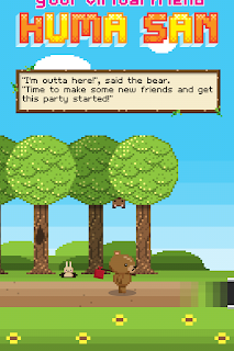
     When you start the app up you get a cute little story as to why Kuma is living in this building.  It seems like a nice idea.  However, this story plays every time you start the application up.  If you switch apps for a moment and switch back, you will have to skip passed this story again, rather than just viewing the screen you left the application on.
     Kuma lives in a one story building and you must add floors with the coins you collect through playing the game.  Your goal is to make the building very big so that it is worth a lot of money.  Why?... I... I don't know.  Apparently Kuma is elitist.
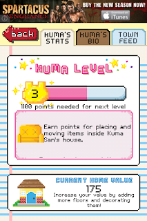
     There are many tasks you will need to complete for Kuma.  They are generally very easy, but the payout for them is incredibly small.  You will do them mainly for experience.  As this will cause Kuma to gain levels. So we now have 2 goals... Build a tall home worth a lot of money, and level the bear up by completing tasks.
     You can also earn experience by arranging the furniture, buying items, feeding Kuma and so on.  That bring me to another point...
     Kuma does not need to eat.  Eating does not give him energy... He will not die if you do not feed him.  You need to purchase the food and it has no benefit in any way.  The only time you will get anything from it seems to be when your task says to feed him.  Then feeding him will complete a task.
     Kuma will make comments while he is wandering around his house.  I feel like the phrases written for Kuma were written either by or for someone around the age of 10-12.  He discusses passing gas, television shows, and so on.  I find it to be more annoying than fun.  He also wanders about, passing gas and laughing about it.  Why does he do this?... I have no clue.  I really wish there were some sort of "personality toggle" where you could give him a personality that is more fitting for what you would enjoy.
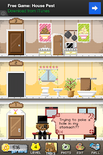
     The application isn't very old so there is not really a large selection of items to use for decorating the home or dressing your Kuma.  But much of what is available seems nice.  Some of the more expensive items are interactive.  Kuma can 'use them'.  however, it doesn't tell you which are which.  You cant find out until after you have purchased the item.  And some items are really... not as interactive as you might want them to be.  When you click an item and it has a "Use it" bubble you can click it and Kuma will go perform an interaction with that item.  For the bed, he takes a nap... For the loo, he sits and reads a paper.  For the bath he washes up.  However, the bookshelves sometimes say "Use it"... He just stands in front of it.  He doesn't face it.  He doesn't read a boo... Apparently Kuma is confused as to how to use a bookshelf.  Why even bother putting the interaction feature there if you have no interaction assigned to it?
     The mall... Clicking the mall button takes you to the additional parts of the game.  You can purchase clothing or furniture here.  You can purchase treats as well.  However, I think they went over board.  They added too many extra features to the mall.  There's a place where you can read "inspirational messages" a place to see your horoscope, a place to play 2 mini games, a place to buy coins, a place to edit photos, a place to invite friends, a place with jokes and riddles, a magic 8 ball, facts & trivia, achievements page, news, settings and so on...  This application is completely overloaded with useless junk.  Yes, some of those things are nice, but does it really need all that?  No.  Pick something you want to do with the app you create and stick to it!  It's a ruddy cluster of useless tid bits.  I suggest getting rid of the entire "Kuma Chat" section, Kumas Korner (You can get this information from the main page already), Photobooth (Make is a separate application), The Treats place (Take out the eating feature all together, there is no point to it), along with several other things.
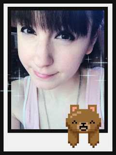
     Alright, let's discuss the Photo booth now...  There is a section where you can load up or take a photo and add frames and stickers to it.  You can also screen capture Kuma in his home and decorate that instead.
      The options for this are very limited, but I believe that is because they set this up as an extra feature rather than just making the photo section it's own app.  Why not have a whole collection of Kuma applications, rather than forcing everything into one.  The frames are cute, as are the stickers.  there just aren't many to choose from.  Many have to be purchased with the coins earned from playing the game.  To the left you can see a sample photo done in the application.
     There are also 2 mini games for this application in the arcade part of the mall.  Playing these games will earn you coins if you do well.  There is also a high score section.  The games aren't bad, but I feel like they may be better off as their own application as well.  Though I admit it is a fast way to earn extra coins.
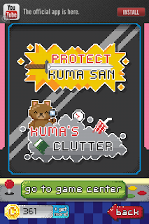
     The first game is Protect Kuma San.  This takes place in a forest.  There are items that pop up here and there and several spiders.  Kuma wanders about the screen and the spiders approach him quickly.  You can click the items such as coins and treats to earn extra points/coins.  However, they are small and often I have clicked directly on them several times and the game does not recognized that I have.  The spiders move quickly and often Kuma is at the edge of the screen (Since you can't control his movement), so he gets attacked quickly.  Once his life bar is empty, it's game over.  It's a fun game, but I think it could use a little tweaking.
     The second game is Kuma's Clutter.  it shows a messy room and gives you a list of things to find within the room.  This can be difficult on iPhone because of the screen size and how small some of the items are.  I don't know about most people, but with my limited eye sight, I find this game to be more frustrating than fun. I can barely make out what half of the items are.  You are timed and get coins depending on how many items you find and how quickly you found them.  if you are having trouble the hint button will show you where one of the items is.  However, it will deduct points from your total score.
     In closing I believe the main problem with this game is that there is too much going on.  they went overboard with the additional features' that it almost makes the game more of a hassle than a joy.  The Kuma character is visually cute and I enjoy dressing him up.  However, his attitude/personality I personally find to be unattractive.  I don't see a real goal in the game.  There are so many different things you're supposed to be doing, it makes you confused on what it is they really want you to do. Score high in the mini games, complete the tasks, get your achievements, level your bear, make your house worth more, build floors, furnish the floors, feed the bear, and so on...  I think the application had the potential to be really great, but somewhere along the way the original concept and idea got lost and buried until unnecessary fluff.
     Sorry, Kuma... You're not getting a high score from me.  Maybe if the app creators rethink this application and make some changes, I'll redownload it... But for now... I'm deleting it off of my iPhone.
Rating: 2/5
  • Free
  • Category: Games
  • Updated: 13 September 2012
  • Version: 1.1.2
  • Size: 20.5 MB
  • Language: English
  • Developer: W3 Innovations, LLC

Friday, September 21, 2012

Saturday Morning RPG

Saturday Morning RPG App for iPhone
     Grab your magic trapper keeper, scratch those scented scratch-n-sniff stickers and defeat bad guys who look like they are from G.I.Joe and He-man, but are vaguely different enough to not legally be infringing on copyrights of the creators of those shows... Yes... Safe!
     This is an RPG that 80s kids can really get on board with.  It brings together all the quirky and fun things from our childhood and creates an epic adventure based around them.
     You are a young teen named Marty, and your girl friend has been kidnapped by Commander Hood!  Can you defeat his minions and battle your way to his wedding before it's too late?
     The first episode of this game is free.  you can purchase other episodes for a fee.  The first episode basically gets you informed on how to play.  A 'totally gnarly dude" will help you get on your way.  Teaching you how to use your magical trapper keeper and telling you about the battle system.
     You can use the money you obtain in the game, via battles, to purchase useful items out of the dispensers you will see now and then.  Care bears, Basketballs, Transformers... Each item has a unique ability that can be used during your battles.  You can see some of them in the screen shot to the right.
     After each battle you will get rated on how well you did.  How fast did you kill them?  How much damage did you take?  And so on...  You want a good score so you can get more money.  You can see a sample of what this looks like to the left.  it will also show you how close you are to leveling.
     If you want to keep track of how Marty is doing, open your trapper keeper and check out his stats.  You can see how much money you have also.  As well as switching out different scratch-n-sniff stickers, items and so on.  This is also a great place to look and see what quests you have.  Sometimes it's easy to forget, when they stack up.
     The battle system is interesting.  They have 3 different ways you can battle, depending on which you feel more comfortable with.  I find this to be very interesting.  It allows the user to choose how to fight based on their own comfort and ability.  It can take a little getting used to, however.  You have to power up, choose an item, select a target, preform the item's task to use it, block incoming attacks.  Sometimes I wish it was a bit more simple.  But I am sure that you get more used to the way this game play is, the more you use it.  One episode wasn't quite enough for me.
     One thing that is never explained for the quests in episode one... I had to look up.  The stones for entering the magical cave.  You need to play the saxophone riff for "Who Can It Be Now".  I was unsuccessful in entering the cave.  No matter how many times I played the riff, or how much I tried changing it up, that bloody cave would not open.  However others seemed to use it and enter with no trouble.  I'm not really sure what I did wrong.  And since there is no explanation for it within the game, there wasn't much I could do but eventually give up and walk to the ending (I had done everything else up until that point).
Abandoning the cave means not completing 2 quests.  The Jerk quest can not be complete without entering the cave as well as the quest to... enter the cave.  I heard there are also nice items within the cave.
     Once you have beat the first episode you will be in your virtual living room.  You can see it to the right.  You can interact with the items.  Through this screen you can check your stats, replay episodes, or buy new ones.  You can check your cereal box tops, etc.  And you can certainly tell by the pattern on the couch that this is an 80s living room.
     I have added a Youtube video I found that will show you the game play for the beginning of the game to give you a feel for how the game dialog is.  I really enjoy the dialog, personally.
  I enjoyed this game and I think anyone who was alive in the 80s or at least the early 90s will also feel nostalgic while playing it.  It's available for iPhone, iPad or iPod Touch 3rd gen and higher.  So why not give it a try?  The first episode is free with the game.  If you relly like it you can buy additional episodes.  I'd say it takes between 10 and 30 minutes to beat episode 1 depending on how quickly you get through the battles and how much exploring you do.
Rating: 4/5
  • Free
  • Category: Games
  • Updated: May 09, 2012
  • Version: 1.01
  • Size: 66.1 MB
  • Language: English
  • Seller: Joystick Labs, LLC
Rated 12+ for the following:
  • Frequent/Intense Cartoon or Fantasy Violence
  • Infrequent/Mild Alcohol, Tobacco, or Drug Use or References
  • Infrequent/Mild Realistic Violence
  • Infrequent/Mild Profanity or Crude Humor
  • Infrequent/Mild Simulated Gambling

Wednesday, September 19, 2012

Oldify

Oldify App for iPhone
     Have you ever wondered what you would look like in 20, 30, 40... even 50 years?  What will you look like as an old man or woman?  Well, this app could give you a basic idea.  This is of course also assuming you do not age very gracefully.
     When you load the application up you'll see a photo booth strip.  After you've made a few oldify images you can pull on the strip and view any of the images you have made in the past.  Bring them up and giggle or show people you know.
     At the bottom of the launch screen you can see icons for this app maker's other applications that you may choose to download.  One that makes you bald, one that makes you fat... and even a mustache application.
     Click on the prominent "start" button toward the top to begin the aging process.
     The camera will load automatically.  You can either take a photo from scratch using the camera or you can load one from your device.  Clicking the folder in the bottom left will allow you to access your device's storage to rummage through your photo albums.  At the top right corner, you can switch from front camera to back camera.  Or visa versa.
     If taking a new photo, try to get your face inside the guidelines shown on the camera.  If choosing a photo from your albums, choose a front facing photo that can easily be moved within said guidelines.  As you will be made to do this, once your photo is selected.
     Now you have one more step before becoming old and haggard... You will see your photo with a long sort of rounded rectangle toward the bottom.  This must be positioned over your mouth.  The two small circle marks must be positioned on your eyes.  This is for animation purposes.  The app will make it look as though the subject is blinking, coughing, yawning and so on.
     Click ready and watch the lovely graphic of two charming young people turn elderly... Then, your photo will appear...
     Your photo will animate as I stated earlier.  You can see the capture to the right in mid animation.  It looks better when you're actually watching it move.  The subject's head will move about.  They'll sigh, grunt, etc.  You can even hear them.  I find it interesting that the males sound like males and the females sound like females (In my experience)... Because no where does it ask you for a gender.  It must be bloody good at guessing.
     Below you can see another example of the before and after.

     Now that you have your future self... What do you do with him/her?  Well, you can share them with friends or family.  You can see on the left side of the finished screen there are buttons for emailing or uploading to Facebook.  There is also the option to download the finished image to your device.  This will not be animated.  it will upload it as a still image.  You can remove the buttons by clicking the arrow on the right middle of the screen.
     You can go home and start all over with a new image by clicking the home image at the top left.  If you'd like to see your photo young again (But still animated) you can also do that by double tapping the screen.  You'll still blink and look around... but you'll be young as you were when you took the photo.
     I actually really like the fact that they go out of their way to animate the results.  It's a really interesting feature and I enjoyed it.  I think the results are quite nice.  It's fairly believable.  I suggest only using photos without glasses.
     I think 99 cents is a reasonable price for the work that went into this application.  It's not something I see myself using often.  I'll likely remove it from my phone soon.  However, it's something I am glad I got to try out.  I feel it was money well spent.  Very entertaining.
Rating: 5/5
  • $0.99
  • Category: Entertainment
  • Updated: Aug 22, 2012
  • Version: 1.8
  • Size: 20.5 MB
  • Language: English
  • Seller: Apptly LLC

Tuesday, September 18, 2012

How To Make Origami

How To Make Origami App for iPhone
     This is a cute application that teaches you to create your own folded paper creations, called origami.  There are many categories and within each category, many different designs to choose from.
     When you first download and open the application, there are only a couple of origami designs available to try.  However, you can download more designs through the application, for free.  This way you only have designs for things you actually want to make.  This is a great idea, I feel... Because it doesn't take up unneeded storage for designs you'll never want to use.
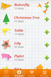
     To the right, you can see some of the designs you can download.  Just click the plus buttons to add them to your collection.  It even shows you how many steps each design takes.  The more steps, the more difficult the origami will likely be to create.  Start with the easier ones and work your way up.
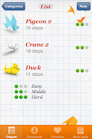
     When you have your designs downloaded you can choose a category to go to, to choose which piece you want to create.  To the left you can see my list of bird type designs.  This list shows the difficulty level of each design, and what the finished piece should look like.
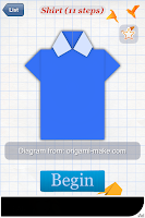
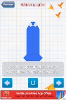
     You can click on the design you intend to begin making.  Get your paper ready. To the right you can see I've chosen a T-shirt design.  Click the begin button and the application will take you through the process, step by step.
     Each step will have a picture of what the paper should look like at that point.  It will also show a short animation so you know how to fold it, in case the instructions written below the image are puzzling or too confusing to understand.  Clicking the middle button below the design will show the animation sequence over again.  Sometimes watching it a few times will better give you an understanding of what you are supposed to be doing.  The back button takes you back a step and the forward arrow, to the next step.  These can come in handy if you realize you misperformed a step or didn't do something you should have.  You can back track and see where you went wrong.
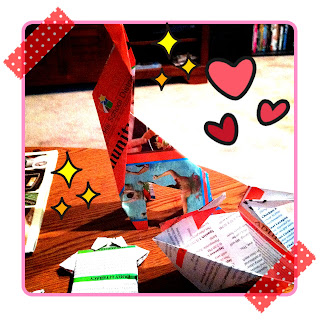
     I made several of the designs in the application to see how easy the process was and how easy the steps were to understand.  Also some of the origami is a bit odd to me, since it involves cutting, most of them do not.  Personally, I don't consider it origami if you have to cut the paper at some point.  I made the T-shirt (Which most people make from a dollar bill and leave as a tip.  This is because the initial shape is that of a long rectangle and not a square, as traditional origami is), the giraffe (Which requires cutting for the legs), the star (Which requires cutting and in the end is just a flat piece of paper in the shape of a star, and not a folded star shape), and the duck.  You can see some of my creations to the right.  I made them from pieces of magazine paper, so they aren't the most visually appealing origami creations.  They are the giraffe, the T-shirt and the duck.
     Overall I believe this is a very useful and fun application.  It has pieces easy enough for a small child (Around 5-7) to follow along with and ones more complicated that someone older may want to preform.  Best of all, each of the designs are free to download and use.  I love that it has animation to help guide you, and that you can replay the animation when you need to.  I really enjoyed this application and I think you will too.
Rating: 5/5
  • Free
  • Category: Education
  • Updated: Sep 07, 2012
  • Version: 1.0.10
  • Size: 12.0 MB
  • Language: English
  • Seller: Sergey Burlakov

Monday, September 17, 2012

BatteryGirl App for iPhone

BatteryGirl App for iPhone
     This is a cute utility for telling how much battery life your device has left.  All in all a little pointless since you can simply turn the battery percentage feature on... But this is a much cuter way of telling what's left.
     Battery Girl is a 17 year old girl named Michiru (Michelle).  She will do different activities depending upon how much battery life your device has.  Her 'energy level' is the same as your device's.
     When you have a lot of battery life she does more physical things, like exercising.  When you have less, she does more relaxing activities like eating doughnuts and walking about.  When your device is connected to a power source she uses a foot pump to pump the battery energy bar up.  Work that energy bar, Michiru!
     Along with the energy bar, you also have a percentage amount at the top.  At the bottom is a button with her face on it.  This is how you interact with Michiru.  Tap it to hear what she has to say.  She makes little noises and sometimes says a few words.  But her speech bubbles have full sentences.
     There is also an information button at the bottom to learn about the application as well as the character.  The exit button takes you back to the launch screen.
     At the launch screen you see two options.  The Battery Room which is the main part of the application.  The screen capture to the left if the battery room.  It's the area of the application I just described.  The other option is the Battery game.
     The battery game is a lot like the bubble pop flash game you may or may not have run across on the internet.  Basically you want to fill all the battery bars.  A full battery bar explodes in 4 directions.  The fragments hit the first other battery bar it comes in contact with, adding one point to each.  Different coloured bars are for different directions.  Green bars explode in North, South, East & West.  The yellow ones explode in diagonal directions.  North West, North East, South East & South West.  Once a course is emptied, a new one will load, with more bars.  You'll want to go fast, however,  The large bar on the side will slowly go down.  If it runs out of juice, it's game over.  Completing battery bars will slowly fill it back up.
     I have added some screen captures below from the game mode.

     When switching modes, you get a sort of 'load screen'.  These are interesting pictures of Michiru.  Running, fixing her hair and so on.  It's just an interesting extra feature for the application.  Personally I think it's cute.
     This is a fun and cute application.  You can leave it running to let you know what the battery life is at all times.  But that seems a little silly.  What I would like to see added is a clock feature.  If it told you the time as well as the battery life, you could use it as a clock on your desktop as well as a way of knowing where your battery is.  It would make this great application perfect, in my opinion.
     The artwork is good, Very clean and the colours work well.  Visually appealing. The game is fun, and the high scores keep you wanting to do better and better.  The character voice is cute.  She speaks only in Japanese but all of the text is in English.
     I'd recommend this application for people who like cute utilities or just for the game.  However, if you're using for something legitimately useful then you might want to pass this one up and find something else to download.  This is more for the cute appeal and the fun than for 'serious business' necessities.
Rating: 4.5/5
  • Free
  • Category: Games
  • Released: Oct 15, 2011
  • Version: 1.01
  • Size: 9.8 MB
  • Languages: English, Japanese
  • Seller: SHUNSUKE ITO